Learning Zone
Diabetes UK
Diabetes UK is the UK’s leading diabetes charity. They needed a way to revitalise their Learning Zone to deliver a more personalised, data-driven experience. The goal was to design a platform that learns from users’ interactions to tailor content and support tools, thereby increasing relevance and engagement.
The redesigned Learning Zone would not only provide educational content but would also offer motivational features to help users maintain and improve their health outcomes. The platform aims to bridge the gaps left by traditional healthcare resources, providing users with tailored, day-to-day management tools.
The challenge
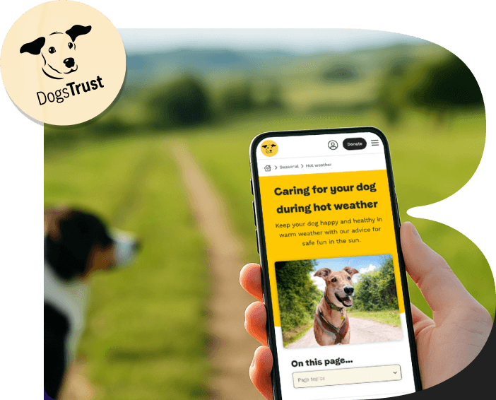
The existing Learning Zone provided useful information, but it felt outdated, lacked personalisation and did not reflect modern expectations of digital health tools.
Internally, the Diabetes UK team was highly knowledgeable and passionate, with expertise spanning healthcare, learning, and technology. However, they had spent almost a year struggling to prioritise features and define a clear product direction. Competing ideas and good intentions had led to over-scoping, with no shared understanding of what should be built first or what was realistic within budget.
The challenge was not only to design a better experience for users, but to help the organisation move from abstract discussion to evidence-based decisions that balanced user value with delivery effort.
My Role:
Lead UI/UX designer
Product:
Diabetes Health Platform
Produced at:
Aer Studios
Target Audience:
Individuals over 16, with type 1 or type 2 diabetes, their caregivers, and healthcare professionals


The Solution
Through a user-centred design process, we reimagined Learning Zone with input from stakeholders, real users and healthcare experts. We ran discovery workshops, mapped user needs, and prototyped new features that could adapt over time. The result was a smarter, more supportive platform built around real-life challenges and motivations.

Co-design workshop 1: Framing the problem
I conducted stakeholder interviews to understand the vision, constraints, and success criteria for the platform. Alongside this, I carried out a UX landscape and competitor review, producing an annotated report to highlight relevant patterns, opportunities, and gaps.
I then designed and co-facilitated a two-day discovery workshop, guiding the team through:
Empathy mapping and photo-personas
Mapping existing and future-state user journeys
Identifying pain points and opportunity areas
Dot voting to surface priorities
Paper prototyping to externalise ideas quickly
This helped surface assumed user needs, clarify business requirements, and reveal where ambition was out of step with feasibility.

Co-design workshop 2: From ideas to structure
Using insights from the first workshop, I created low-fidelity wireframes exploring key concepts such as onboarding, dashboards, and goal-driven content. These were refined collaboratively in a second workshop and evolved into a mid-fidelity interactive prototype that could be tested with real users.


Proposed features:
Frictionless Registration: a simplified onboarding that collects essential user data, enhancing personalisation without creating barriers to entry.
MOT Check-Up Quiz: An assessment feature that provides users with feedback on their self-management practices, followed by tailored content suggestions to support their needs.
Personalised Dashboard Feed: A curated daily feed that uses interaction data to deliver personalised content at optimal times, improving relevance and accessibility.


Emotional Check-In: A feature allowing users to log their emotional state, providing content recommendations that support both their physical and emotional well-being.
Push Notifications & Goals Tracking: Features that provide timely reminders and allow users to set and track health goals, which foster long-term engagement and encourage proactive self-management.


User testing
I developed a clickable Figma prototype and discussion guide and conducted ten one-hour user testing sessions with people living with, or caring for someone with, type 1 or type 2 diabetes.
Participants were recruited through Diabetes UK and offered a £25 Love2Shop incentive. The cohort represented a mix of ages and backgrounds, including under 40, 41 to 65, and 66+.
Between sessions, I iterated on the prototype, introducing lightweight personalisation such as using participants’ names and diabetes type within messaging. This had a noticeable positive impact on engagement.
Key insights included:
- Strong appetite for personalisation and goal tracking
Emotional support was as important as educational content
Many users felt let down by existing NHS support and valued a tool that felt more human and responsive
At this stage, we explicitly introduced prioritisation frameworks to support decision making. User needs were captured as user stories and assessed collaboratively using:
Impact versus development effort
MoSCoW prioritisation (Must, Should, Could, Won’t)
Identification of non-negotiables
This shifted conversations away from opinion-led debate and toward trade-offs grounded in evidence and cost. These insights directly informed what was prioritised for MVP.


The results
The discovery phase concluded with a comprehensive discovery report that equipped Diabetes UK with:
A validated product vision
A prioritised MVP feature backlog
Clear rationale for what to build now versus later
Prototype, Wireframes, UI designs, user flows, and epics ready for delivery
Crucially, the work helped the organisation move from prolonged internal debate to a shared, evidence-based roadmap that balanced user needs with budget and development reality.
Although another supplier ultimately delivered the build due to cost considerations, our discovery work unlocked progress after months of inertia and gave Diabetes UK the confidence to go to competitive tender with a well-defined, user-centred product plan.